
Design & Branding
Pick a style template and accent colour for every customer-facing surface.
Design & Branding#
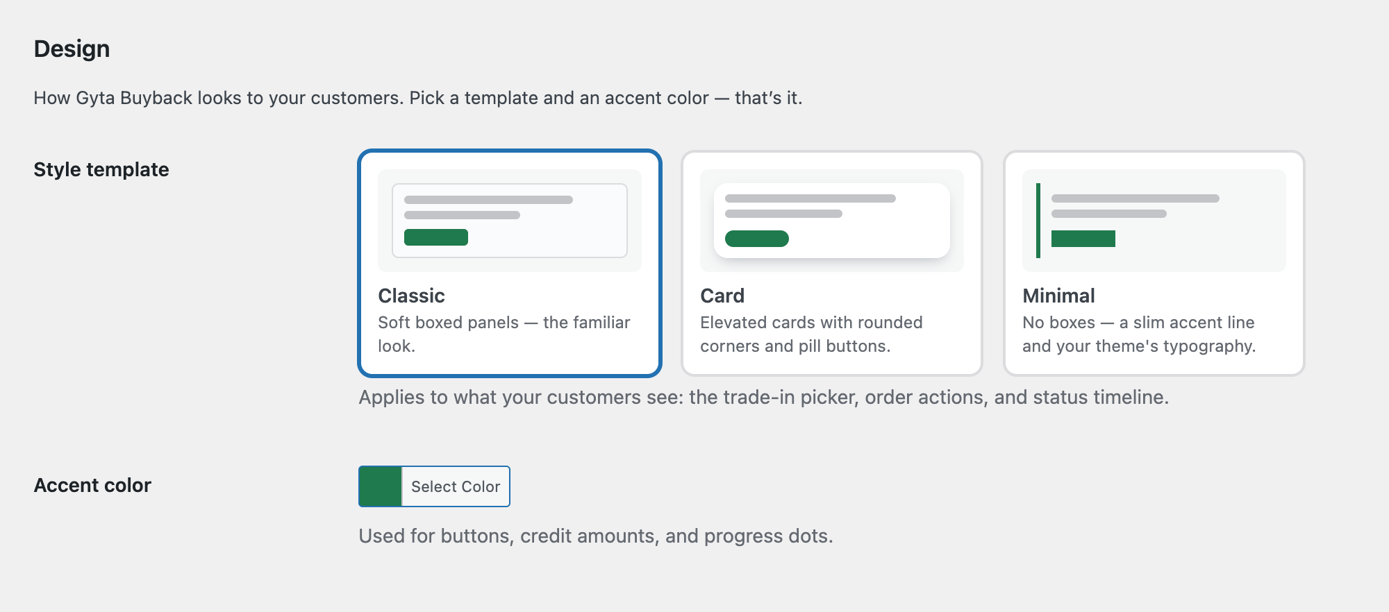
Everything Gyta Buyback shows your customers — the trade-in status timeline, the label and approval buttons on the thank-you page, the trade-in credit summary, the QR drop-off panel — shares one small design system. You choose a style template and an accent color, and every one of those surfaces follows it. Reach for this when the plugin's panels look bolted on rather than part of your store: pick Minimal if your theme already has strong styling of its own, or Card if you want the trade-in flow to stand out as its own polished step.
Design is a free feature — both controls work on the free plugin, with no upgrade prompt. Pro-only surfaces such as the trade-in quiz or the My Trade-ins account tab simply inherit the same look once you have them.
Where to Find It#
Go to Gyta Buyback → Settings → Design. The tab holds exactly two settings:
- Style template — three preview cards you click to select: Classic ("Soft boxed panels — the familiar look."), Card ("Elevated cards with rounded corners and pill buttons."), and Minimal ("No boxes — a slim accent line and your theme's typography.").
- Accent color — a WordPress color picker, described in the settings as "Used for buttons, credit amounts, and progress dots." The default is #1f7a4d (green).
Click Save changes and the change is live — there is nothing to publish, no CSS to write, and no per-page setting.
What Each Template Changes#
The template controls the panel chrome, the corner radius on buttons, and the border style on the plugin's own dropdowns and text fields:
- Classic — a very pale grey panel with a thin border and 8px corners; buttons and fields get 6px corners. This is a refined version of the pre-1.6.1 look, so leaving it selected keeps your store close to how it looked before.
- Card — a white panel with 16px corners, a soft drop shadow, and more padding; buttons become full pills and fields get 10px corners.
- Minimal — no panel at all: a transparent background with a 3px accent-colored rule down the left edge. Buttons become square, and the plugin's text inputs and dropdowns drop to a single underline so your theme's typography leads.
What the Accent Color Touches#
The accent is used for the solid primary buttons (approve, print label, apply trade-in credit), the outline buttons (track shipment, QR code, remove), the credit and quote amounts, the completed steps in the status timeline, and the left rule on the Minimal template.
Some colors are deliberately fixed and will not follow your accent, because they carry meaning:
- Decline / "I DO NOT approve this order" buttons stay red.
- In the status timeline, the step the order is currently on stays blue, a declined step stays red, and steps still to come stay grey. Only the completed ticks use your accent.
Which Pages Follow It#
The template and accent apply to the customer-facing surfaces the plugin renders itself:
- The trade-in status timeline and the quote-expiry countdown
- Thank-you page order actions: print or download label, Track Shipment, and the approve / decline buttons
- The QR drop-off panel and the shipping-kit tracking box
- The trade-in credit summary in the cart and on the thank-you page (net settlement)
- The trade-in quiz, the re-quote inspection photos, and the My Trade-ins account tab cards
Good to Know#
- The block checkout is intentionally left alone. Gyta Buyback's block-checkout integration uses WooCommerce's own native block components so it always matches your theme. Your template choice and accent color do not restyle it — they apply to the classic-checkout and thank-you/account surfaces.
- Only two values, and both are validated on save. The template is restricted to classic, card or minimal; anything else falls back to Classic. An accent that is not a valid hex color is discarded on save, and the plugin then renders with the built-in #1f7a4d green.
- Classic is the default, and it is also the fallback if the setting has never been saved — so upgrading leaves you on the familiar Classic look until you choose otherwise.
- The accent is injected as a CSS variable (
--wcpti-accent) alongside a small stylesheet that loads on every front-end page. That is deliberate: it keeps the styling correct under full-page caching. If you change the accent and still see the old color, clear your page/CDN cache. - Minimal ties the two settings together. Its only visual chrome is the accent-colored left rule, so on Minimal the accent color does more work than on the other two templates — a very pale accent will make those panels almost invisible.
- Only the plugin's own dropdowns and text inputs are restyled, and inside the plugin's panels they are capped at 360px wide. Your theme's other form fields, and anything WooCommerce renders, are untouched.
- There is no per-template color scheme. Panel backgrounds are fixed per template (very pale grey for Classic, white for Card, transparent for Minimal) — the accent is the only color you control.